Visual language
Seen on the street.
How Graffiti Soul Records looks in the wild: the way we shoot, treat and lay out images, dress a release and show up on social and on the web.
Photography direction
Real light. Real places.
Our photography is documentary first and cinematic second. It is shot in the places the music comes from, under the light that is actually there.
Real light
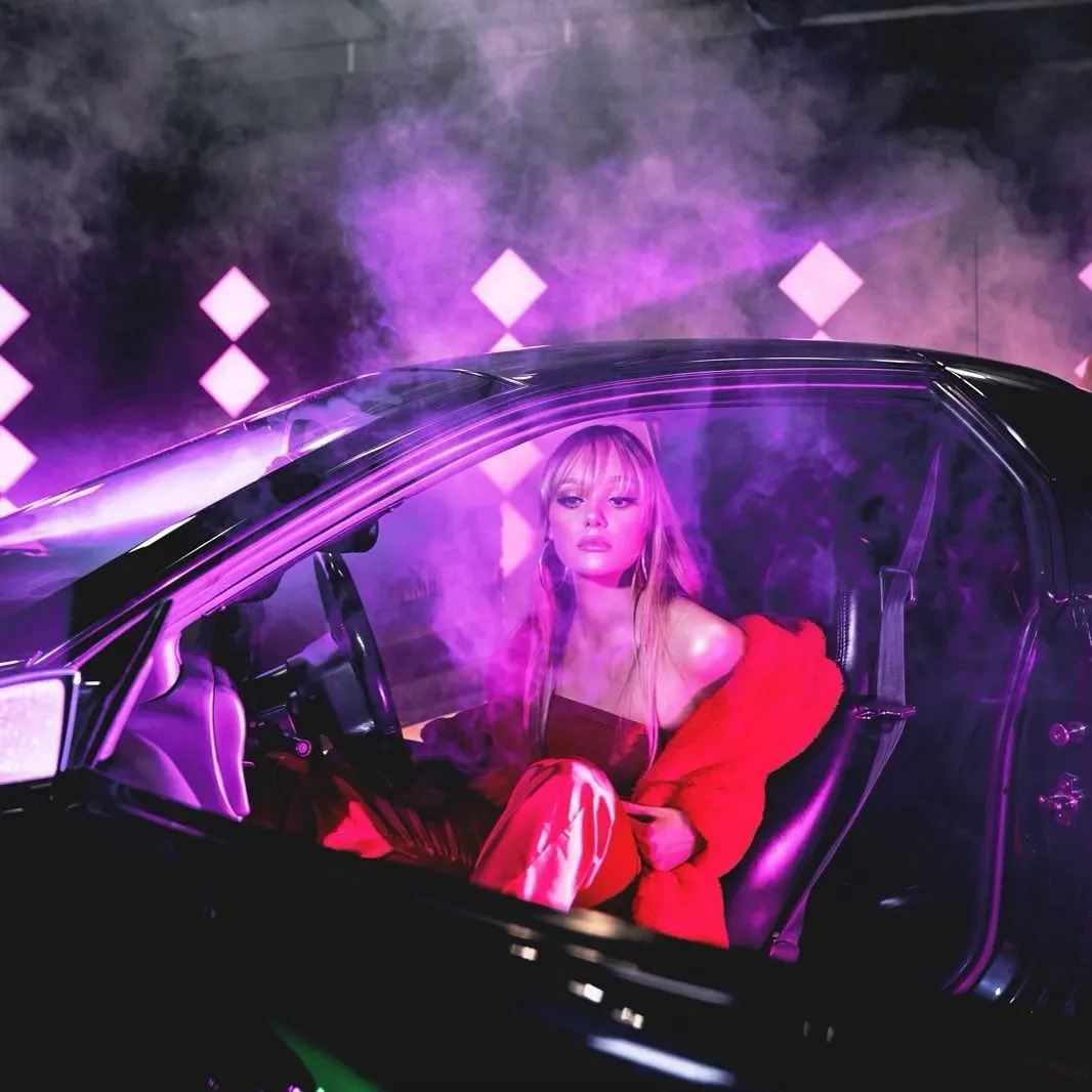
Practical light, hard flash and neon. Night, tunnels, cars and studios over flat daylight.
Direct presence
Artists look at the lens or clearly away from it. Never a stock smile, never a generic pose.
Honest skin
Tattoos, scars and texture stay in. Retouching removes distractions, not character.
Place as character
Concrete, brick, chrome and signage. The location should feel like the artist's world.
Room for type
Frame with negative space so headlines and marks can sit without covering the subject.
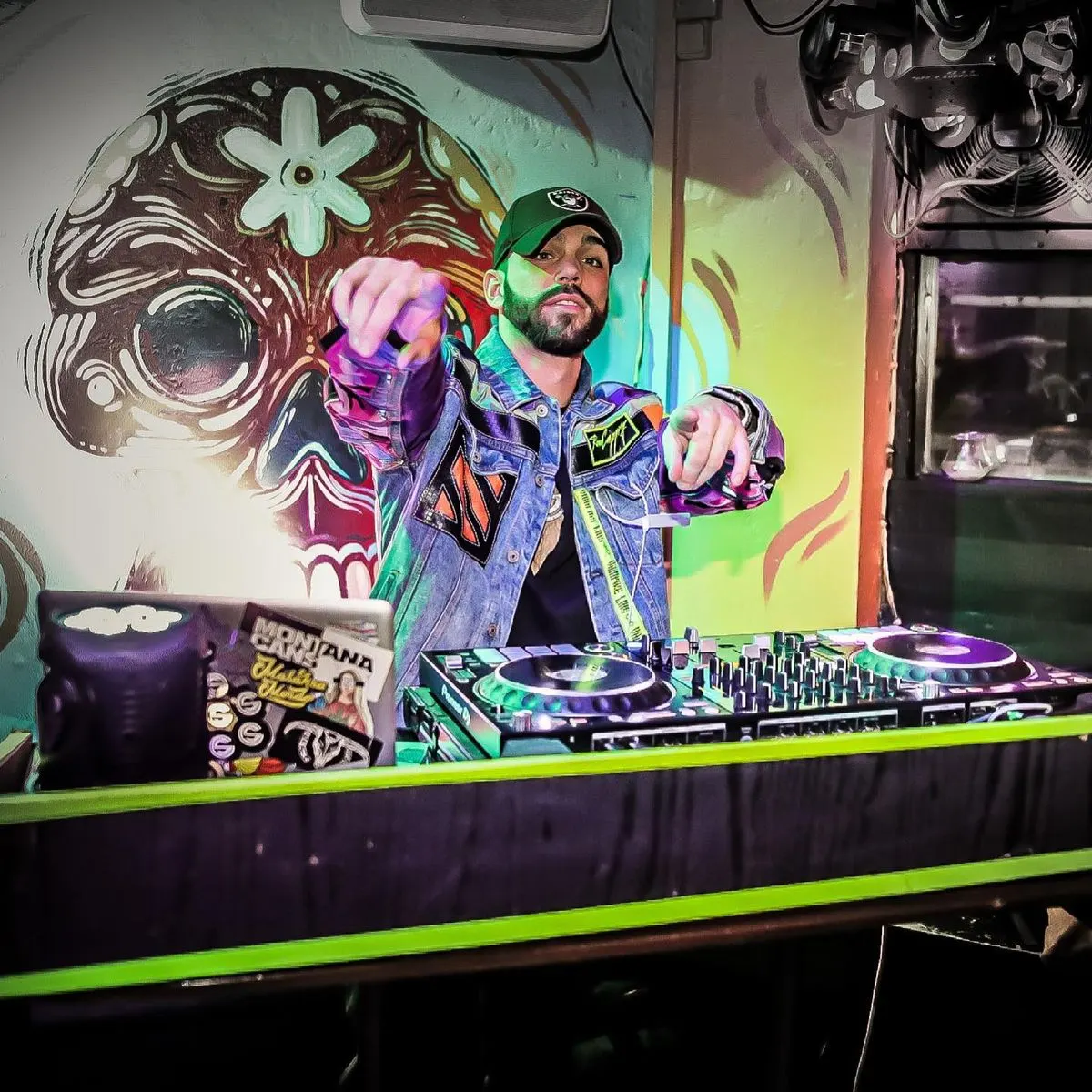
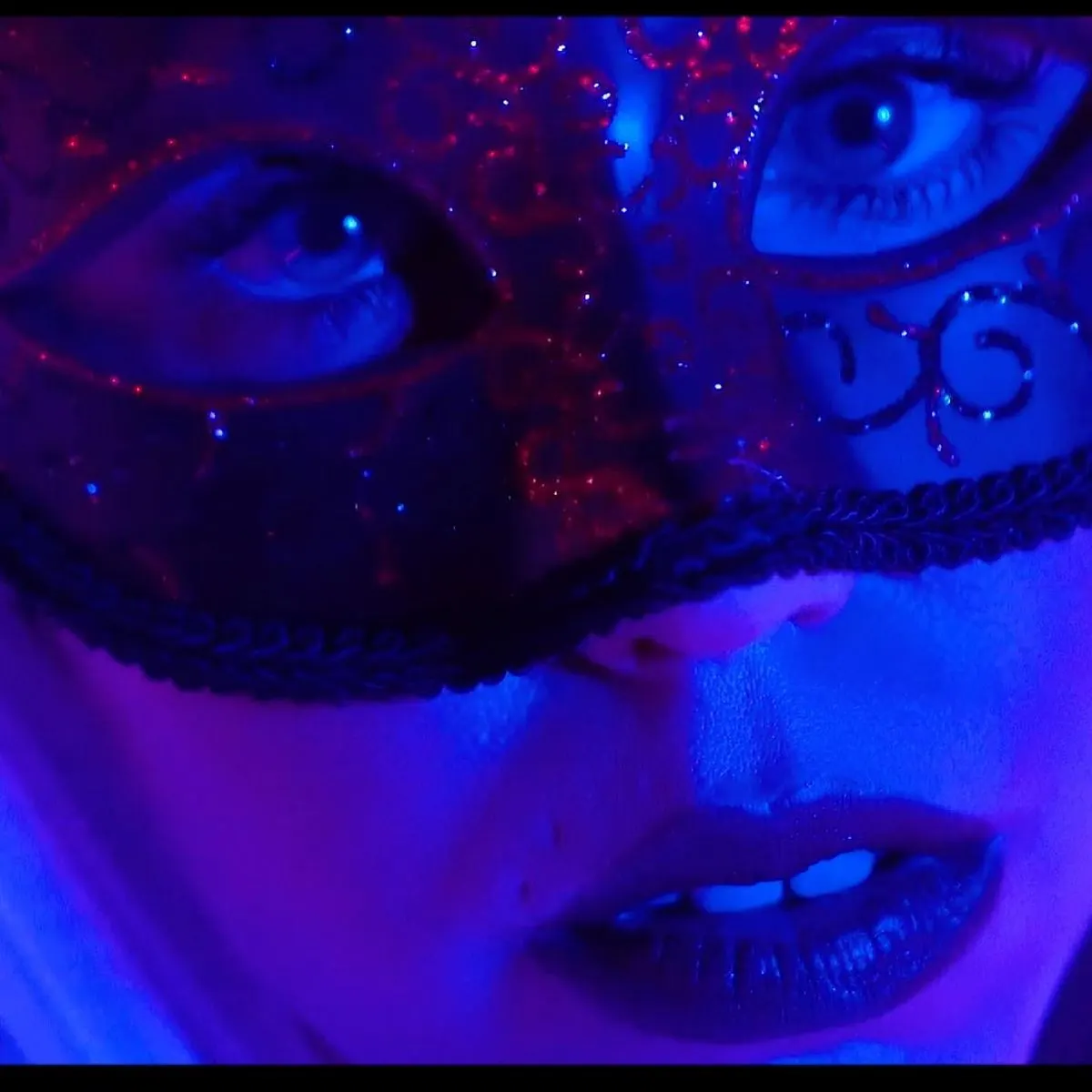
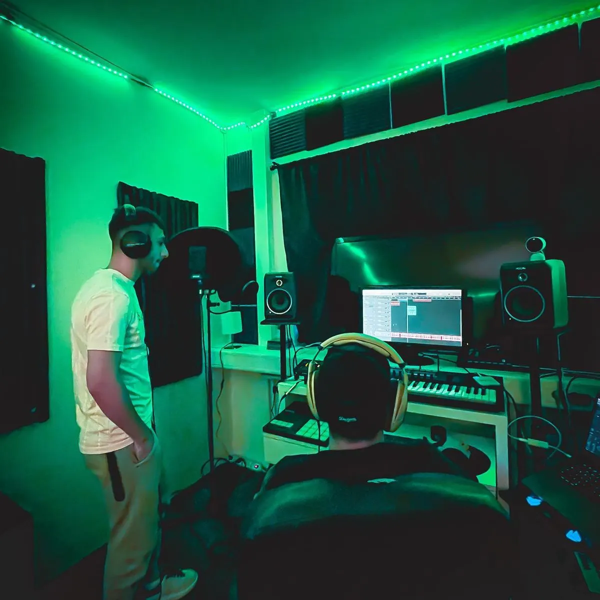

Five shot types
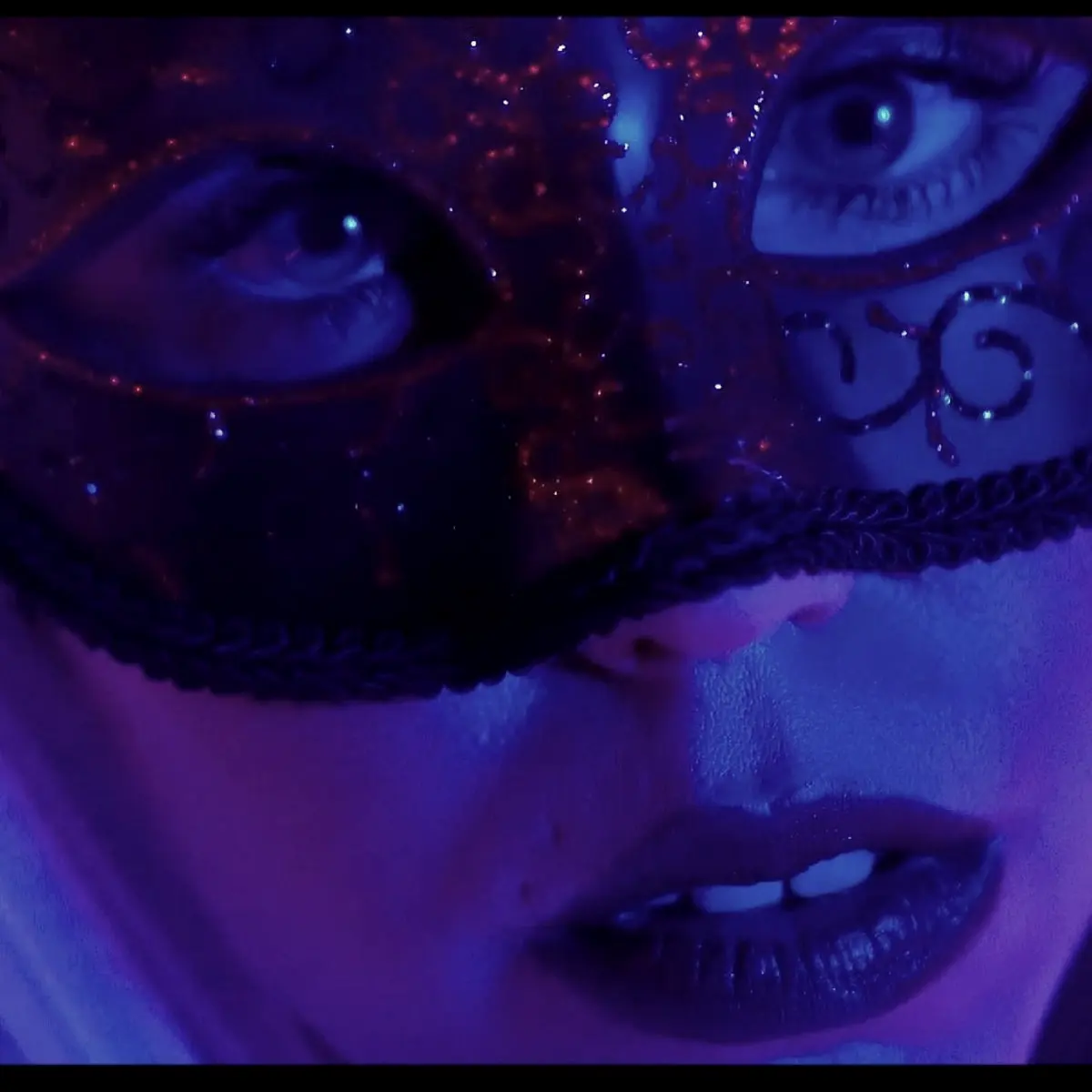
Portrait
Tight, direct, close to the artist. Soul territory.
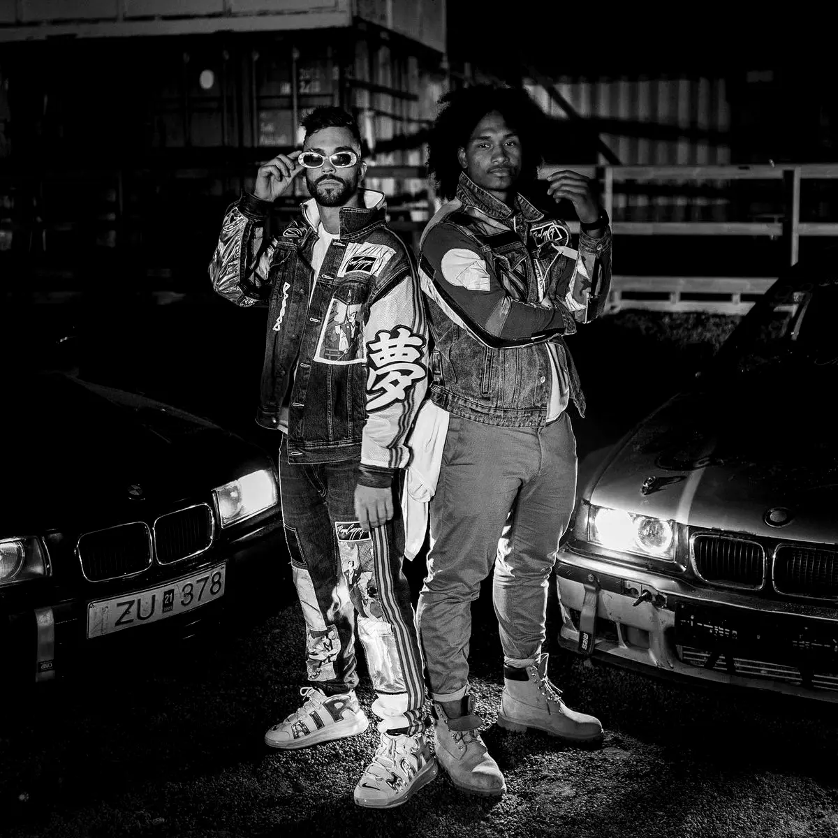
Street
Artist in the city, wide enough to read the place.
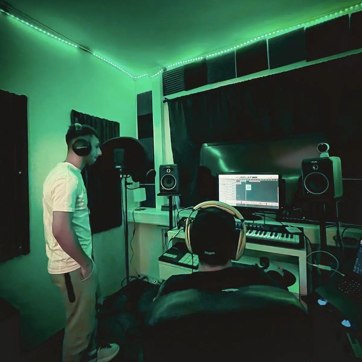
Studio
Process, gear and collaboration in real rooms.
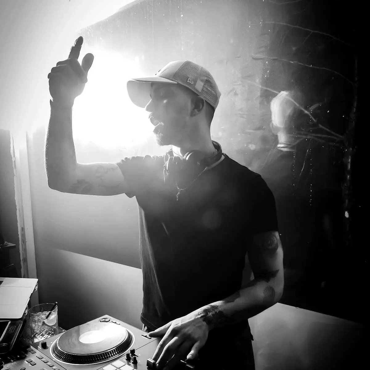
Live
Decks, crowds and motion, blur allowed.
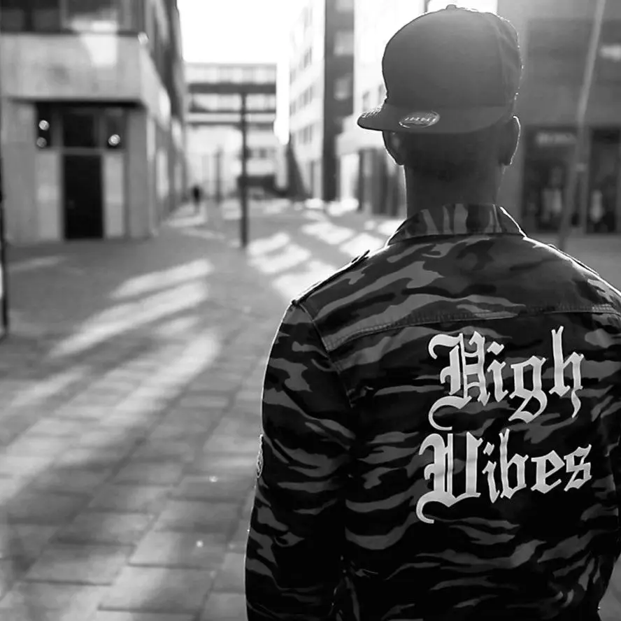
Detail
Hands, ink, jackets and objects that tell the story.
Image treatments
RAW. SOUL. MARKED.
Three treatments keep a mixed archive of nightlife, studio and street photography feeling like one label. Choose one per image, never stack them.
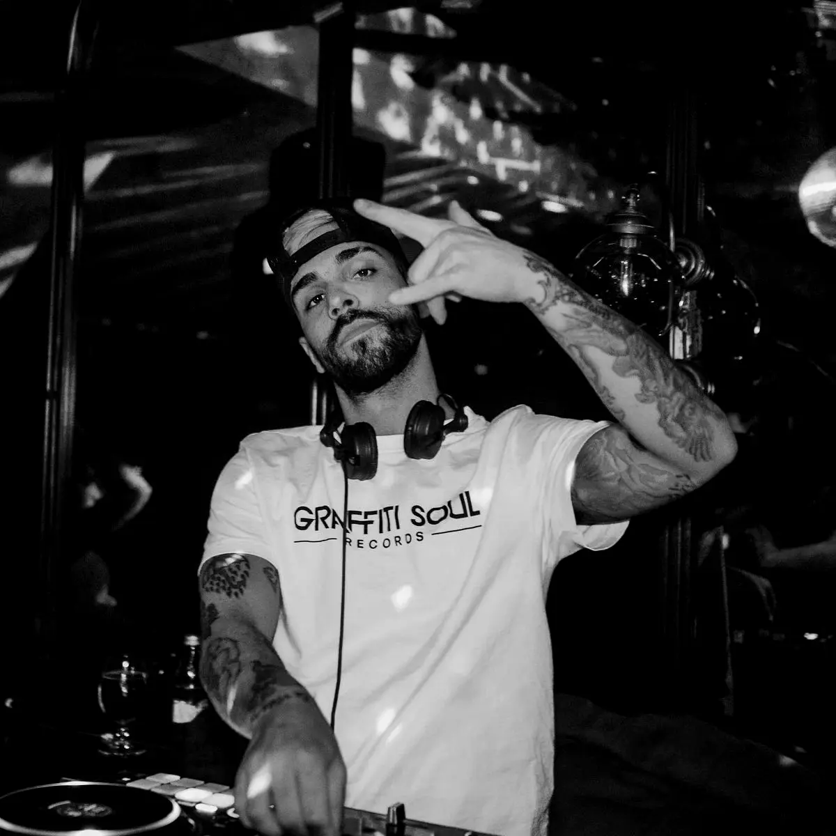
RAW
Grit and evidence
- Monochrome
- Auto-levelled contrast
- Crushed blacks, visible grain
- Slight underexposure
Use for: Street, live and documentary imagery. The default for editorial and social.
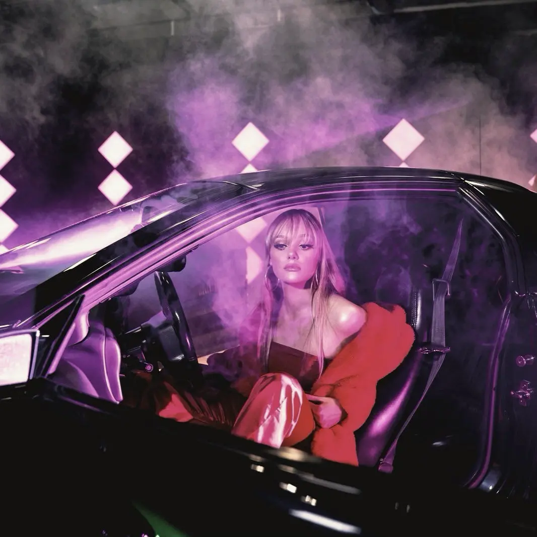
SOUL
Warmth and feeling
- Colour retained, muted
- Warm bias, lifted blacks
- Soft vignette
- Fine grain
Use for: Portraits, ballads, intimate moments and anything led by emotion.
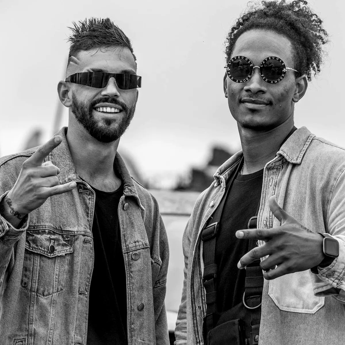 no trespass
MARKED
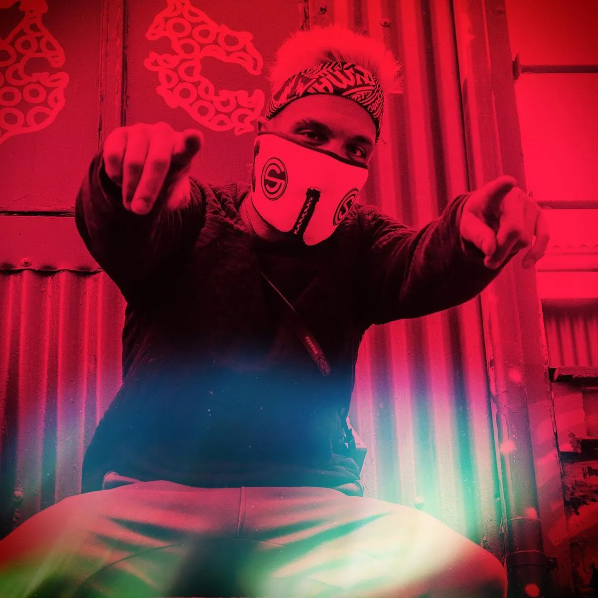
The vandal touch
- RAW base
- One Tag Red mark
- Tape or sticker detail
- Optional handwritten line
Use for: Release drops, announcements and hero moments. Once per layout, never on every post.
Before / after
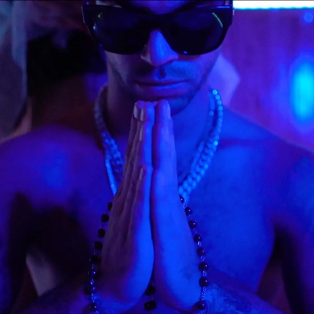
Original
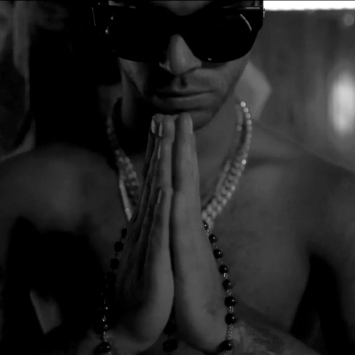
RAW
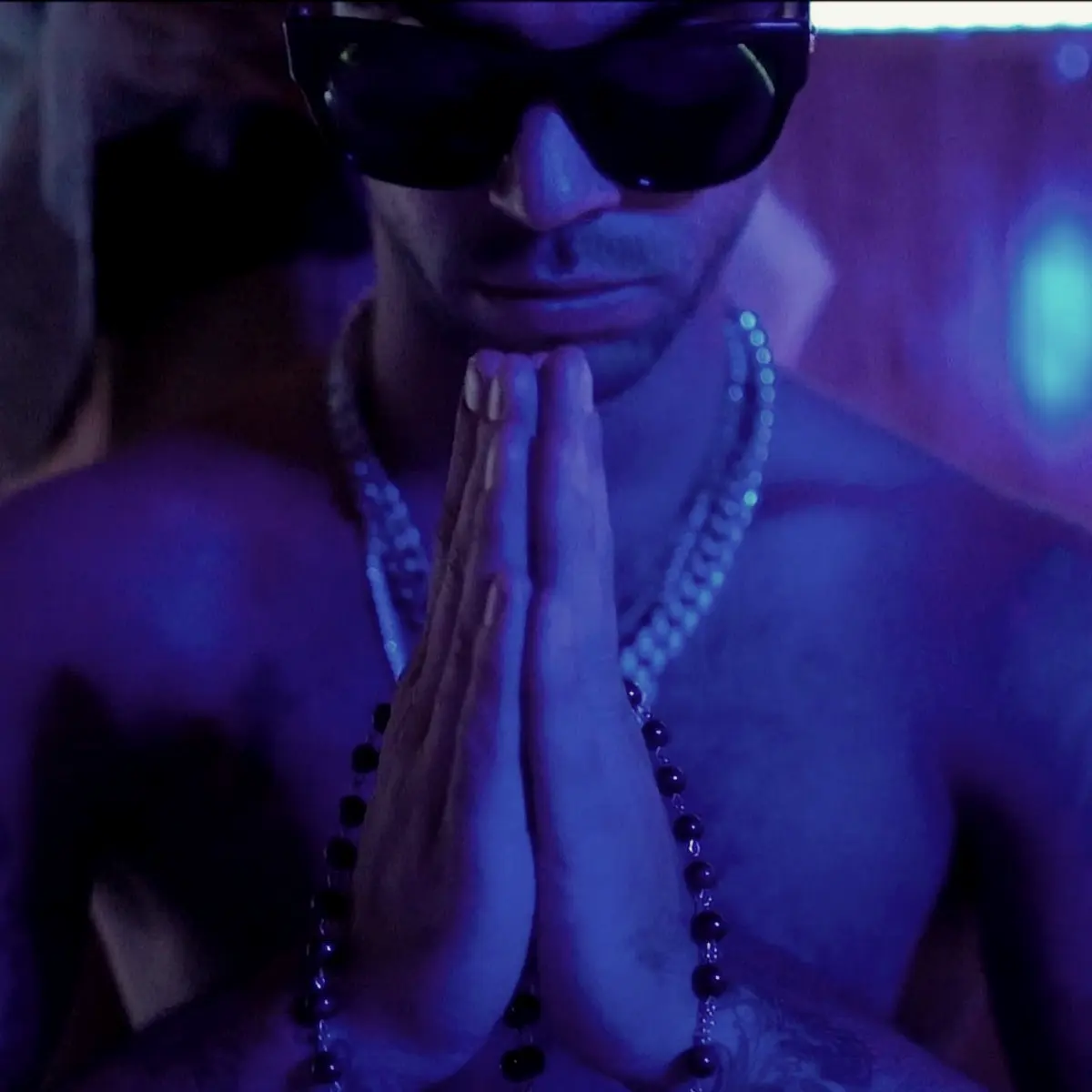
SOUL
amenMARKED
Editorial layout system
Grid first. Then break it.
Every page, poster and post starts on a 12-column grid. The structure is what makes the vandalism feel intentional.
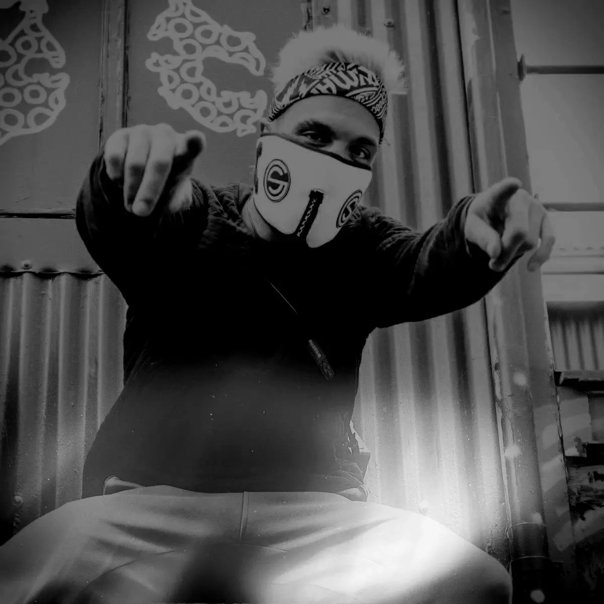
Artist
Name
A — Cover
Full-bleed image, one giant headline, logo pinned to a corner.
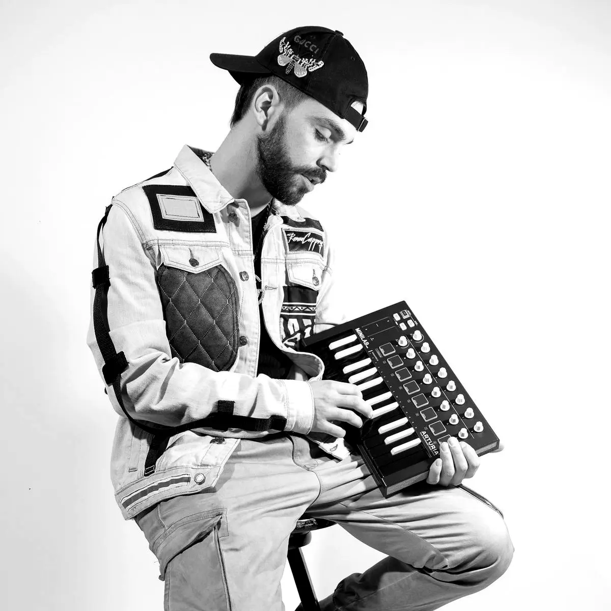
Artist File 01
“A pull quote sits here. One line, one redword.”
B — Feature
Bone paper, image in 7 columns, standfirst in Playfair, a red word for emphasis.
Index
- Street01
- Soul02
- Ink03
- Editorial04
C — Index
Type-only list on concrete. Rules, numbers and one tag.
Grid
12 columns, 24 px gutters, 40 px outer margins on screen and 12 mm in print. Everything aligns, then one thing breaks.
Scale
Extreme contrast in size. A headline several times larger than the body, with clear steps between.
Space
At least a third of any layout is empty. Silence is what makes the tag loud.
Ratios
4:5 for portraits, 1:1 for covers, 16:9 for video, 3:4 for posters. Crop tightly and deliberately.
Hierarchy
Label, headline, standfirst, body. Four levels, never more.
Album-artwork relationship
Their picture. Our frame.
Artwork belongs to the artist. The label supplies a quiet, consistent frame so a release is recognisable on any shelf, screen or wall without ever overruling the art.
Artist name
Release title
GSR-001
Front — artwork 1
Artist name
Release title
GSR-002
Front — artwork 2
Artist name
Release title
GSR-003
Front — artwork 3
- 01 Track one
- 02 Track two
- 03 Track three
- 04 Track four
- 05 Track five
Credits, notes and rights in Inter, 8 pt minimum.
Back — editorial system
The artist owns the picture
Cover art expresses the artist. The label never imposes a template, palette or typeface on the artwork itself.
The label owns the frame
A consistent set of small elements identifies a GSR release across every format.
Stamp bottom-left
The Mark sits bottom-left at a fixed proportion (9% of the cover width), in Bone or Tag Red.
Catalogue number
Every release carries a catalogue number in Inter, GSR-001 onwards, set on the spine, back cover and credits.
Back and spine
Back covers follow the editorial system: Soul Black ground, Anton track list, Inter credits and the wide wordmark.
Website direction
A wall you can scroll.
This site is the reference implementation of the system. Structure and pace from the editorial world, texture and attitude from the street.
Controlled
Chaos
Dark first
Soul Black canvas, Bone type, Tag Red reserved for action and emphasis. Concrete and paper surfaces punctuate the scroll.
Photography leads
Full-bleed images with the RAW, SOUL and MARKED treatments, always with a scrim so type stays readable.
Slow motion
Reveals and settles that feel deliberate. Nothing bounces. Everything respects reduced-motion preferences.
Fast and light
A static site, optimised images and system-grade performance. Music is the heavy part, not the page.
Accessible by default
Keyboard support, visible focus, AA contrast for text and Tag Red kept to large type and graphics.
Site structure
- Home
- Cover, the 80/20 rule, pillars, The Wall, roster, manifesto, submit a demo.
- The Label
- Foundation, positioning, pillars, tone of voice and the manifesto.
- Artists
- Roster, releases and collaborators.
- Identity
- Logo system, colour, typography, The Wall and tattoo illustration.
- Visuals
- Photography, treatments, editorial layout, artwork, social and web.
- Contact
- Demo submissions, press and licensing.
Social content families
Five families. One feed.
Content is planned in families so the feed reads as one voice at any speed. Each family has a look, a format and a job.
OUT NOW
Drops
1:1 · 4:5 · 9:16 · MARKED
Release announcements, pre-saves and out-now posts. Artist artwork with the label stamp and a single Tag Red mark.
In the room
Studio
4:5 · 9:16 video · SOUL
Sessions, gear, works in progress and late-night studio moments. Process shown honestly.
Say it loud
The Wall
1:1 · 4:5 · GRAPHIC
Typographic posts: lyrics, quotes and statements on concrete, paper and paste-up. The brand at its loudest.
The file
Artist Files
4:5 carousel · RAW / SOUL
Profiles, short interviews and portrait carousels in the editorial layout system. One artist, one story.
After dark
Street Signals
1:1 · 9:16 · RAW
Events, city moments, scene news and playlists. What is happening around the label and why it matters.
Feed rhythm