

The Label

Artist-first. Always.

Graffiti Soul Records is an urban music label built around individuality, street culture and authentic expression. This is what we stand for and how we show up.

01

Brand foundation

Why we exist.

Mission

To give independent urban artists a home where their individuality is protected, their craft is taken seriously and their work reaches the people who need to hear it.

Vision

A label the culture trusts: recognisable at a glance, impossible to mistake for anyone else, and always led by the artist rather than the algorithm.

  • 01

    Individuality

    We sign voices, not formulas. If an artist sounds like everyone else, we have not done our job.

  • 02

    Authenticity

    Real places, real stories, real faces. We would rather be honest and rough than polished and empty.

  • 03

    Craft

    Loose is not lazy. Every mix, master, frame and layout is finished to a standard the artist can be proud of.

  • 04

    Ownership

    Artists stay in the driving seat of their sound, their image and their story, with clear terms and no surprises.

  • 05

    Community

    Scenes are built by people showing up for each other. Collaboration is the label's default setting.

02

Positioning

Between the street and the studio.

Graffiti Soul Records is the artist-first urban music label built around individuality, street culture and authentic expression. We sit between the raw energy of the street and the discipline of an editorial studio, so every release feels both lived-in and considered.

Creative focus

  • Hip-hop
  • Rap
  • R&B
  • Trap
  • Alternative urban
  • Crossover artists

Personality

  • Expressive
  • Artistic
  • Gritty
  • Confident
  • Culturally driven

Who we speak to

Listeners
Culture-first fans aged 18 to 35 who discover music through people, scenes and playlists, and care about who made it.
Artists
Independent rappers, singers, producers and DJs who want a partner with taste, not a machine.
Partners
Venues, festivals, brands and creatives who want to work with a label that has a point of view.
Two artists in denim jackets and sunglasses
03

Source concept

Controlled chaos.

Our concept is a tension we manage on purpose: rigorous design with deliberate damage. The rule that keeps it in balance is simple. 80% sophisticated, 20% vandalised.

20% vandalised

The 80. Order.

  • A strict 12-column grid and generous margins
  • Anton headlines, Inter body copy, one editorial serif
  • Soul Black and Bone carrying most of the surface
  • Photography with a clear subject and a clear crop
  • Consistent logo placement, spacing and rhythm

The 20. Vandal.

  • One red tag, circle or strike per layout
  • Torn edges, tape and paste-up layering
  • Drips, overprints and rough ink on a headline
  • Grain, halftone and photocopy texture
  • A single line of marker handwriting, three words at most
04

Four pillars

Street. Soul. Ink. Editorial.

Two artists posing beside parked cars at night
01

Street

Made where it happens.

Street is where the music is born and where it is tested. It gives the label its grit and its honesty, and it keeps us close to the culture we serve. We shoot outside, we borrow the language of signage and stencils, and we treat the city as a collaborator.

In practice

  • Location shoots after dark and in open air
  • Stencil, sticker and paste-up graphics
  • Partnerships with local writers, promoters and venues
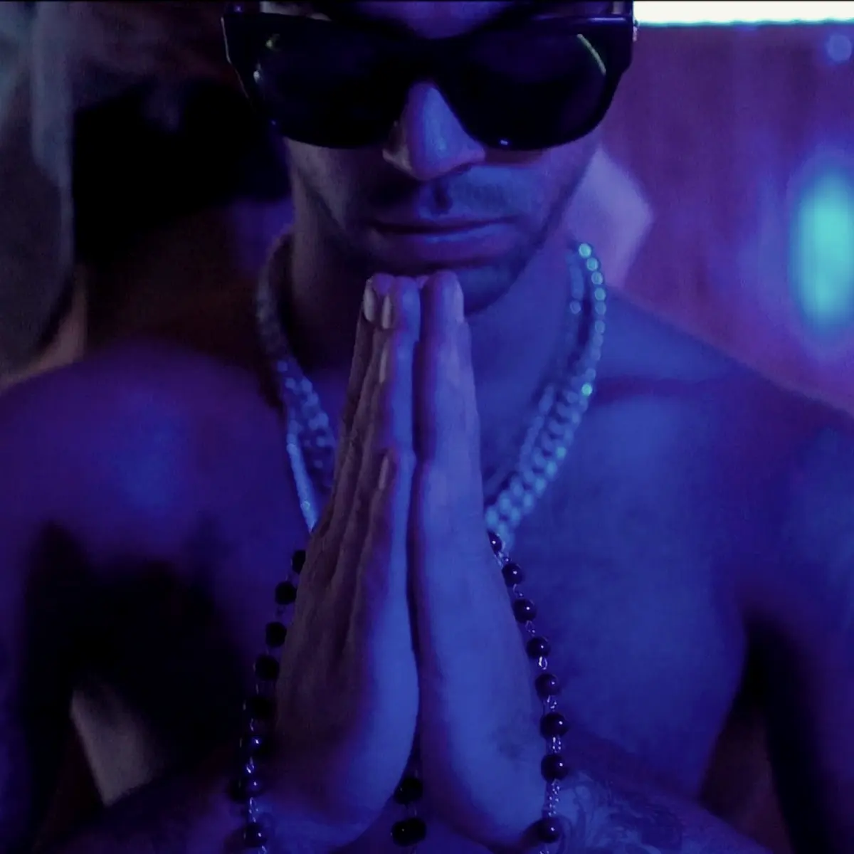
Hands pressed together in blue light
02

Soul

Say the real thing.

Soul is the emotional centre of the label. It is why an R&B ballad and a trap anthem can sit on the same roster. We look for honesty in performance, and we give it space: closer crops, softer light and copy that speaks like a person.

In practice

  • Intimate portraiture with a direct gaze
  • Warm, lifted SOUL image treatment
  • Plain-spoken, human copywriting
Tattooed DJ wearing a Graffiti Soul Records shirt
03

Ink

Permanent by design.

Ink is the label's permanent mark. Tattoo culture taught us that identity can be chosen, drawn and worn for life. It shapes our illustration, our merch, our black-and-red palette and our belief that a good mark should never need explaining.

In practice

  • Tattoo-style illustration for covers and merch
  • Heavy black, one red, hand-drawn line
  • Collaborations with tattoo artists
Producer holding a MIDI keyboard against a white wall
04

Editorial

Designed like it matters.

Editorial is the 80%. It is the discipline behind the noise: strong grids, confident typography, considered white space and clear hierarchy. It signals that the label takes its artists seriously, and it makes the vandalism land harder.

In practice

  • Grid-based layouts with big, calm type
  • Feature-style artist profiles and interviews
  • Print-ready press kits, sleeves and posters
05

Tone of voice

Say it like you mean it.

  • Direct

    Say it once, plainly. Short sentences. No filler.

  • Warm

    We talk like a person who cares about the music and the people making it.

  • Sharp

    A little dry, a little dangerous. Confidence without shouting.

  • Grounded

    Specific over vague. Names, places, sounds. No empty hype.

New record. Out Friday. Turn it up.

We are thrilled to announce the release of a groundbreaking new project!

Written in one night. Mixed in three weeks.

An unforgettable sonic journey like no other.

Send us your best three tracks.

Please submit your material for our consideration.

Not for everyone. That is the point.

Appealing to a wide range of audiences.

Release announcement
New from the roster. Eight tracks, one room, no skips. Pre-save now and hear it first.
Artist bio
Raised on late-night radio and rooftop cyphers, they write about the city as they find it: loud, tender and unfinished.
Demo reply
Thanks for sending this. We listened all the way through. Here is what stood out, and where we would push it next.
06

Manifesto

The manifesto.

We believe every wall has a story and every voice deserves one.

We are not a factory. We are a room where artists arrive as themselves and leave louder.

We keep the structure sharp so the noise can be wild.

Eighty percent discipline. Twenty percent damage. Never the other way round.

We put the artist first, the name on the sleeve, the face on the poster, the final say on the sound.

We take the street seriously. We take the soul seriously. We take the ink seriously. We design like it matters, because it does.

We make things that are meant to last: a record, a mark, a memory.

We don't clean up the wall. We frame it.