Identity system
One mark. Many walls.
The logo, colour, type and graphic language that make Graffiti Soul Records recognisable at a glance, and flexible enough to live on a sleeve, a screen, a wall or a sticker.
Logo system
Five configurations.
A triangle holding an S: an arrow, a warning sign and a spray-can nozzle at once. It works in five configurations, each with a job to do.
- 01
Primary lockup
The default. Mark above the name. Use on covers, press kits, packaging and anywhere the label introduces itself.
Min. 24 mm / 110 px wide
- 02
Wide wordmark
Horizontal signature with the RECORDS rule. Use for site headers, banners, video end cards and credit lines.
Min. 30 mm / 140 px wide
- 03
The Mark
The S-in-triangle on its own. Use for avatars, favicons, stamps, merch details and release catalogue marks.
Min. 6 mm / 24 px wide
- 04
Tag stamp
The Mark in Bone on a Tag Red block. The vandal version: use once per layout, for release drops and merch.
Min. 10 mm / 40 px wide
- 05
Reversed on Bone
Soul Black artwork on a Bone ground. Use for print, invoices, light-mode documents and paper stock.
Min. 24 mm / 110 px wide
Usage rules
Always
- Keep clear space equal to the height of the S on every side.
- Use only Bone, Soul Black or Tag Red artwork, on a flat ground or a darkened photo.
- Place the logo in a corner or on a grid line, never floating.
- Add a Soul Black scrim behind the logo when it sits on photography.
Never
- Stretch, squash or skew the artwork.
- Recolour it outside the palette or add a gradient, glow or shadow.
- Rotate it. The Tag stamp may sit at up to 3° only.
- Place it on a busy, unprotected image or cover a face with it.
Clear space
Misuse

Colour palette
Black. Bone. One red.
A restrained, near-monochrome palette that lets photography carry the colour. Tag Red is the only loud note, and it is used like a real tag: fast, deliberate and once.
Soul Black
#111111
RGB 17 · 17 · 17
The ground. Pages, backgrounds, black-out overlays.
Bone
#E8E2D8
RGB 232 · 226 · 216
Type, logo, paper stock and light-mode surfaces.
Ink Grey
#292929
RGB 41 · 41 · 41
Panels, cards, concrete textures and depth.
Concrete
#8B8984
RGB 139 · 137 · 132
Metadata, captions, rules and quiet secondary type.
Tag Red
#C62A2A
RGB 198 · 42 · 42
The vandal. Tags, strikes, buttons and one moment per layout.
Proportion
Artist accent concept
Every artist on the roster can carry one accent colour, drawn from their own imagery. It appears in a single gesture, such as a tag, a stripe or a sticker, at no more than 5% of the layout. It replaces Tag Red on artist-led pieces and is never used alongside it.
- One accent per artist, chosen with the artist.
- Label-led pieces always stay Bone, Black and Tag Red.
- Never mix two accents, or an accent and Tag Red, in one layout.
Ultraviolet
#7B4DFF
Acid
#B7F03A
Cyan
#22C7C1
Amber
#F0A11B
Magenta
#E0479E
Cobalt
#2E5BFF
Examples only. Final accents are agreed per artist.
Typography system
Loud. Literate. Legible.
Four typefaces, four jobs. Three of them are disciplined and do the 80%. The fourth is a marker, and it does the 20%.
Display
Anton
Regular 400
Controlled chaos
Headlines, artist names, release titles. Always uppercase, tight leading, generous size.
Editorial
Playfair Display Italic
Italic 400
Made by the artists, for the artists.
Pull quotes, standfirsts and manifesto lines. The voice of the magazine.
Text
Inter
Regular 400 · Semibold 600
Every release is finished to a standard the artist can be proud of.
Body copy, interface, captions and credits. Clean, neutral and highly legible.
Tag
Permanent Marker
Regular 400
no trespass
The 20%. A single handwritten annotation, three words at most, once per layout, always Tag Red.
Hierarchy
- Headline
- Graffiti Soul
- Anton · clamp 56 → 160 px · line 0.92 · uppercase
- Standfirst
- Graffiti Soul
- Playfair Italic · 28 → 40 px · line 1.15
- Label
- Graffiti Soul
- Inter Semibold · 11.5 px · tracking 0.28em · uppercase
- Body
- Graffiti Soul
- Inter Regular · 16 → 18 px · line 1.75
Graphic language
The Wall.
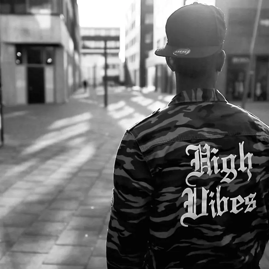
The Wall is our graphic language: a city surface built up in layers. Concrete, paste-ups, stencils, tags and drips give every layout a physical, lived-in feel while the grid keeps it in order.
Say
it loud
- 1
Concrete
The surface. Ink Grey with mottled, low-contrast texture. It gives every layout a physical place to live.
- 2
Paste-up
Photos, paper and print fixed with tape. Slight rotation, torn edges, overlapping frames.
- 3
Stencil
Registration marks, arrows, catalogue numbers and stencil type. The structural graffiti that keeps things organised.
- 4
Tag
Marker scribbles, circles and strikes in Tag Red. The single loudest gesture on the layout.
- 5
Drip
Ink and paint running from the top edge. Used sparingly, as a full stop on a section or a sleeve.
Element library
- Underline
- Circle
- Strike
- Cross
- Arrow
- Tape
- Drip
- Stencil
Rules of the wall
- Never more than three Wall elements on one layout.
- One tag per layout. Two tags is a mess, not a style.
- Wall elements sit on top of the grid, never instead of it.
- Never cover a face, the logo or essential copy with a mark.
- Every mark should look made by hand, not generated by a filter.
Illustration direction
Drawn to stay.
Illustration for the label is drawn in the language of tattoo flash: bold contour, confident line weight, solid black fills and one spot of red. Symbols are chosen because they can be worn for life.
- Line
- A single confident contour, 3 to 6 px at poster scale. Slight wobble is welcome, hesitation is not.
- Fill
- Solid black or open line. Shading uses stipple and hatching, never gradients.
- Colour
- Bone line on Soul Black, or Soul Black on Bone. One spot of Tag Red, in the eye, the blade or the bloom.
- Symbols
- Eyes, blades, roses, triangles, hands, soundwaves, lightning, crowns. Personal, universal and easy to remember.
Where it lives
- Sleeve and cover accents
- Merch prints and embroidered patches
- Stickers, stamps and flash sheets
- Limited skin-stamp moments at launch events
Placeholder motifs shown. Final flash is drawn with the label’s tattoo collaborators.